 7 mins read
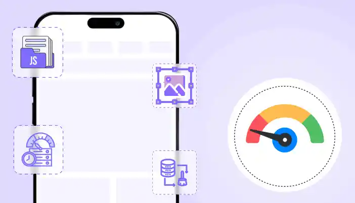
Reason behind the website performing slowly on mobile responsive and its solution
Share Article :


If your website feels fine on desktop but slow on mobile, that is not a mystery. Mobile performance is harder because phones are weaker than laptops, networks are slower, and mobile browsers are less forgiving when you ship heavy pages.
Most people chase a single mobile score and then do random tweaks. That wastes time. You need to fix the real bottlenecks that hurt mobile users.
This guide breaks down the main reasons websites perform slowly on mobile and the solutions that actually move the needle.
First, measure mobile performance the right way
Before you change anything, understand what you are looking at.
- Core Web Vitals are based on real user experience data (field data), not just a lab test. (Google for Developers)
- PageSpeed Insights includes both lab data (Lighthouse simulation) and field data (real users). These can differ a lot, so do not assume one test run represents reality. (web.dev)
What to do:
- Test in PageSpeed Insights on mobile
- Check Search Console Core Web Vitals report (field data)
- Compare a few key templates, not just the homepage (blog post, service page, product page if WooCommerce)
If field data is bad, your real users are suffering. If lab data is bad, you have clear debugging opportunities.
The most common reasons a site is slow on mobile (and the solutions)
Reason 1: Images are too heavy for mobile
Images are often the heaviest resource on a page, and optimizing them can significantly improve performance. (web.dev)
What goes wrong:
- huge hero images
- product images uploaded at full resolution
- no responsive sizing
- too many images loaded at once
Solutions:
- resize images to the maximum size you actually display
- compress aggressively for mobile
- use modern formats where possible (WebP is a practical default for most sites)
- ensure responsive images are served (so phones do not download desktop-sized images)
Tie-in:
- link to your WebP article and position it as the simplest win
Reason 2: Too much JavaScript on mobile (INP gets crushed)
Core Web Vitals includes INP (responsiveness). Heavy JavaScript and long main-thread tasks hurt responsiveness, especially on slower phones. (Google for Developers)
What goes wrong:
- sliders, animations, and page builders pushing tons of JS
- multiple analytics and marketing tags
- chat widgets and popups loading immediately
- scripts loaded site-wide even when not needed
Solutions:
- remove scripts that are not essential
- load scripts only on pages where they are needed
- defer non-critical JS (but do not break core functionality)
- reduce third party scripts on mobile, or load them after user interaction
Reality check:
If you keep adding third-party tools, no speed plugin will save you. You are choosing bloat.
Reason 3: Render-blocking CSS and JS delay first paint (mobile LCP suffers)
Render-blocking resources delay how quickly the user sees meaningful content. This commonly hits LCP. (Google for Developers)
What goes wrong:
- giant CSS bundles loaded before the page renders
- too many CSS files from plugins
- JS in the head delaying rendering
Solutions:
- minify CSS and JS
- reduce unused CSS where possible
- be careful with combining files (it can help or break things)
- exclude problematic files instead of forcing aggressive settings everywhere
Tie-in:
- link to your render-blocking resources article
Reason 4: Layout shifts make mobile feel broken (CLS problems)
CLS is one of the Core Web Vitals. If content jumps around, users hate it. (Google for Developers)
What goes wrong:
- images without width and height
- ads or embeds loading late and pushing content
- popups injected above content
- late-loading fonts changing text size
Solutions:
- set image dimensions
- reserve space for embeds and ad containers
- avoid injecting banners above existing content after load
- keep popups controlled, especially on mobile
Reason 5: Slow server response time makes mobile worse
A slow server hurts everyone, but mobile users feel it more due to network latency.
What goes wrong:
- no full-page caching
- slow hosting or overloaded shared server
- uncached dynamic pages doing heavy database work
Solutions:
- enable full-page caching for cacheable pages
- use proper exclusions for dynamic pages (especially if WooCommerce)
- add compression
- consider object caching for database-heavy sites
If you run WooCommerce, take this seriously: WooCommerce performance work often includes caching strategy, image optimization, database maintenance, minification, and CDNs. (The WooCommerce Developer Blog)
Reason 6: Too many requests (mobile networks get punished)
Mobile networks have higher latency, so lots of small requests can be slower than fewer optimized ones.
What goes wrong:
- multiple CSS and JS files
- too many font files
- icon libraries loaded on every page
- separate scripts for each small feature
Solutions:
- minify and (carefully) combine where it helps
- remove unused libraries
- reduce font weights and font families
- limit heavy icon packs
Reason 7: You are testing the wrong pages
People optimize the homepage and ignore the pages that convert.
What goes wrong:
- product pages slow but not tested
- checkout slow but ignored
- blog posts heavy with ads and embeds
Solutions:
- test your top landing pages
- test your top conversion pages
- test worst-performing templates
- prioritize fixes that impact those pages first
A practical mobile speed fix checklist (in the right order)
- Check field vs lab data in PageSpeed Insights and Search Console (Google for Developers)
- Fix the biggest images first (resize, compress, modern format) (web.dev)
- Turn on caching for cacheable pages
- Minify CSS and JS
- Reduce render-blocking assets (defer non-critical, remove unused) (Google for Developers)
- Cut third-party scripts (or delay until interaction)
- Fix CLS issues (dimensions, reserved space) (Google for Developers)
- Re-test mobile on the same key pages
Do not do ten changes at once. If you do, you will not know what helped or what broke.
How SpeedyGo fits into mobile performance fixes
SpeedyGo is positioned as an all-in-one WordPress speed optimization plugin with features that map directly to common mobile issues: caching, minification, CSS and JS combination, compression, lazy loading, mobile caching, cache preloading, and advanced rules. (Google for Developers)
In plain terms, that means you can use one tool to:
- speed up delivery (caching + compression)
- reduce payload (minification, controlled combination)
- reduce offscreen load (lazy loading)
- apply mobile-specific handling (mobile caching)
But you still need discipline. If your site is overloaded with heavy themes and third-party scripts, no plugin fixes bad decisions.
FAQ
Why is my website slow only on mobile?
Phones are slower, networks are slower, and heavy images and JavaScript hurt more. Core Web Vitals are designed to reflect real user experience, which often exposes mobile issues first. (Google for Developers)
Should I focus on lab score or real user data?
Use lab data to debug and field data to judge reality. PageSpeed Insights and Search Console use real user data for Core Web Vitals reporting, which is the more important signal for actual users. (web.dev)
What is the fastest fix for mobile performance?
Usually images. They are often the heaviest resource on the page, and optimizing them can significantly improve performance. (web.dev)
Does lazy loading help mobile speed?
Yes for offscreen images and embeds. But do not lazy load the main above-the-fold image, or you can hurt perceived loading.
CTA
If you want a simpler way to speed up mobile performance without stacking multiple plugins, use SpeedyGo to apply caching, compression, minification, lazy loading, and mobile caching from one place, then measure improvements on your real pages. (Google for Developers)
Here is a clean blog-style writeup you can publish.
SEO package
- Title: WebP vs JPEG vs PNG vs GIF vs AVIF: Whats the Difference
- Category: WordPress Optimization
- Slug: /webp-vs-jpeg-vs-png-vs-gif-vs-avif/
- Primary keyword: WebP vs JPEG PNG GIF AVIF
- Secondary keywords:
- WebP vs PNG
- WebP vs JPEG
- WebP vs GIF
- WebP vs AVIF
- best image format for websites
- modern image formats
- Meta title: WebP vs JPEG vs PNG vs GIF vs AVIF: Key Differences
- Meta description: Learn the real differences between WebP and common image formats (JPEG, PNG, GIF, AVIF, SVG) and when to use each for faster websites.