7 mins read
How To Reduce WordPress Bounce Rate With Mobile Speed
Share Article :


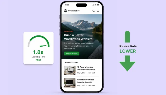
In this blog, you will learn why mobile speed specifically, not just speed in general, is one of the biggest levers you have for bringing your WordPress bounce rate down, and exactly what to fix first if most of your traffic is coming from a phone.
Here’s the stat that started this whole conversation for us:
Google analyzed 900,000 mobile ad landing pages and found that as load time goes from one second to three seconds, the probability of a visitor bouncing jumps by 32%. Not a small dip in patience. A third more people gone, just from those two extra seconds.
If you’ve checked your analytics and noticed your bounce rate looks worse on mobile than desktop, you’re not imagining it. A website performing slowly on mobile can create exactly this kind of problem. Let’s talk about why that gap exists and what you can actually do to close it.
Why mobile speed hits your bounce rate harder than desktop ever will

Here’s something that surprises a lot of site owners:
the average webpage loads about 70% slower on mobile than it does on desktop. Not slightly slower, genuinely, dramatically slower. And mobile visitors already bounce more often than desktop visitors to begin with, averaging around 56.8% compared to roughly 50% on desktop.
This is one reason why website speed matters so much for user experience and engagement.
Put those two things together and you get exactly the pattern showing up in your analytics. Mobile visitors are already a bit quicker to leave, and they’re doing it on pages that are taking noticeably longer to actually show up. That combination is where most of your bounce rate problem is quietly living.
What the numbers actually look like as load time increases
| Load time | Typical bounce rate |
| 1 to 2 seconds | Around 9% |
| 2 to 3 seconds | Around 24% |
| 3 to 5 seconds | Around 38% |
| 5 to 10 seconds | Around 53% |
Look at the jump between the first two rows. Going from under 2 seconds to just under 3 seconds roughly doubles your bounce rate. That’s not a gradual slope, it’s a cliff, and it’s a cliff that happens to sit right around where a lot of unoptimized mobile pages naturally land.
Why WordPress sites tend to struggle with this specifically on mobile
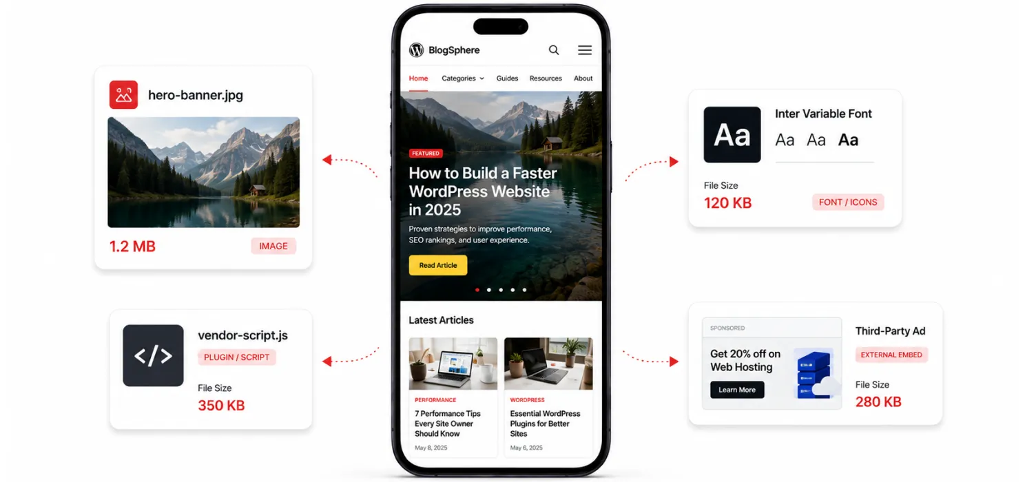
A WordPress site that feels perfectly fine on a desktop, on office wifi, on a fast laptop, can feel completely different on an actual visitor’s phone, on a real mobile connection, in a coffee shop with mediocre signal. A few reasons this gap shows up so often:
- Many themes and page builders were designed and tested primarily on desktop, with mobile treated as an afterthought rather than a first-class experience
- Large, non-responsive images get shrunk down visually on mobile, but the browser still has to download the full-size file. Learning how to optimize images and code can help reduce this unnecessary page weight.
- Plugins that load heavy JavaScript don’t automatically become lighter just because someone’s on a phone
- Ad networks and third-party embeds are often heavier on mobile, since mobile ad formats can include more tracking and rendering overhead
- Font files, icon libraries, and animation scripts all add up faster relative to a slower mobile connection than they do on a fast desktop one
One recent breakdown of this exact issue summed up the stakes pretty well:
“Page speed is a revenue lever, not a technical metric.”
That’s worth remembering here specifically, because bounce rate isn’t just an analytics number to feel bad about. Every visitor who bounces because your mobile site was slow is a visitor who never actually saw what you built for them.
The actual fixes, and where to start
Fix your images specifically for mobile, not just in general
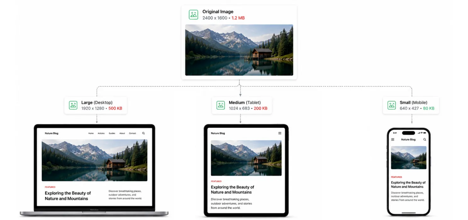
- Use responsive images with srcset, so a phone downloads a smaller file than a desktop monitor would, instead of the same oversized image for everyone
- Compress everything, and use modern formats like WebP or AVIF, since mobile connections feel every extra kilobyte more than a fast wifi connection does
- Never let your hero image be the heaviest file on the page. It’s usually the first thing a mobile visitor is waiting on
Cut down what’s loading before anything is visible
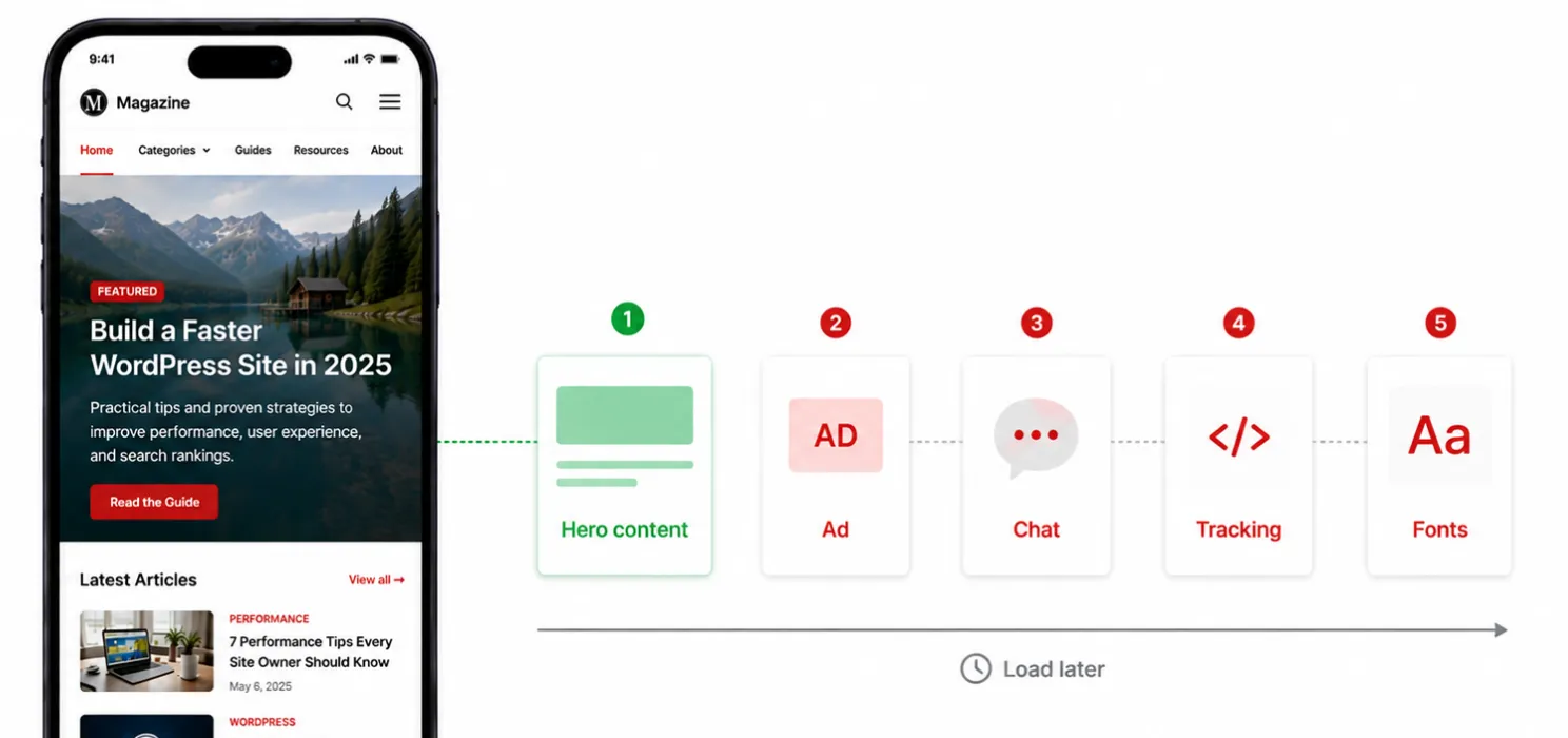
| Note: Mobile devices generally have less processing power than desktops, so the same amount of JavaScript that runs smoothly on a laptop can genuinely feel sluggish on a mid-range phone, even with an identical file size. |
- Defer or remove any script that isn’t needed for the very first thing a visitor sees
- Audit third-party embeds (ads, chat widgets, tracking pixels) specifically on mobile. Some of them load heavier mobile-specific versions of themselves without anyone realizing it
- Reduce the number of web fonts and icon sets loading, especially ones that aren’t actually visible above the fold on a smaller screen
Make sure caching actually applies to mobile visitors too
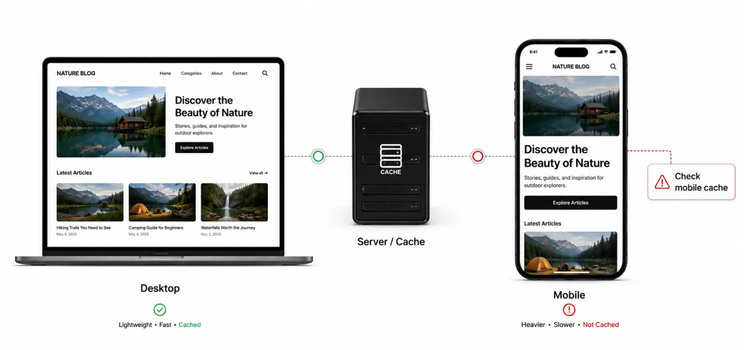
- Confirm your caching plugin isn’t accidentally serving a heavier “desktop” cached version to mobile visitors, this happens more often than people expect with older or misconfigured setups
- If you’re using a CDN, check that it’s genuinely optimizing delivery for mobile networks, not just treating every visitor identically.These steps are part of broader WordPress speed optimization.
| Tip: Test your site with Chrome DevTools’ mobile emulation and a throttled “Slow 4G” connection setting, not just your phone on wifi. Your phone on your home wifi is not what most of your actual mobile visitors are experiencing. |
Keep your layout stable while it loads
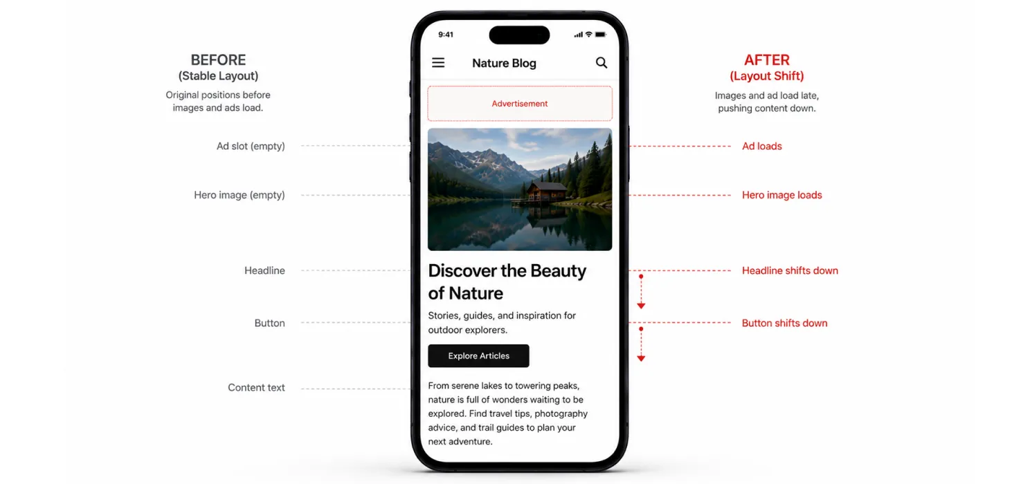
A page that jumps around while loading (images popping in, ads shifting content, fonts swapping in late) doesn’t just hurt Cumulative Layout Shift scores, it genuinely frustrates people trying to read or tap something on a small screen.
- Set explicit width and height on every image so space gets reserved before it loads
- Use font-display: swap so text shows immediately in a fallback font rather than staying invisible
- Reserve space for ad slots and embeds ahead of time, instead of letting them push content down once they load
Test on an actual mid-range phone, not just your own device

Tip: If your own phone is a recent flagship model, your personal experience of your site’s speed is genuinely not representative of most of your visitors. Test on something closer to a mid-range Android device if you can, since that’s a more realistic baseline for a broad audience.
Tools that make this easier to check
| Task | Options worth using |
| Mobile-specific speed testing | Google PageSpeed Insights (check the mobile tab specifically, not just desktop) |
| Real device testing | Chrome DevTools mobile emulation with network throttling |
| Ongoing monitoring | Google Search Console’s Core Web Vitals report, filtered by mobile |
| WordPress-specific fixes | SpeedyGo, WP Rocket, LiteSpeed Cache, ShortPixel or Imagify for images |
Connecting this back to your actual bounce rate
Once you’ve made changes, don’t just re-run a speed test and call it done. Go back into your analytics (Google Analytics 4, or whatever you’re using) and specifically segment your bounce rate by device. Mobile and desktop should be looked at separately, since averaging them together tends to hide exactly the gap you’re trying to close.
Give it a few weeks of real traffic before drawing conclusions. Speed test scores can change instantly, but bounce rate reflects real visitor behavior over time, and it’s worth letting that data actually accumulate before deciding whether a change worked.
To Conclude
Bounce rate isn’t a mysterious number that just happens to your site. On mobile especially, it’s very often a direct response to how long someone had to stare at a blank or half-loaded screen before giving up. The data backs this up clearly: shave off even a second or two, and the number of people who stick around instead of leaving goes up in a way that’s hard to explain with anything except speed.
Start with your images, trim what’s loading before anything’s visible, and actually test on a real mid-range phone instead of your own fast device. Those three things alone tend to close most of the gap between how your site performs on a laptop and how it actually feels to the majority of the people visiting it.

Frequently Asked Questions
Find answers to common questions about mobile speed, WordPress bounce rates, page load times, and practical ways to improve your website’s mobile performance.
Is mobile speed really more important than desktop speed?
Not necessarily more important, but it is especially important because mobile often accounts for a large share of website traffic. A slow mobile experience can cause visitors to leave before the page fully loads.
Will improving mobile speed reduce my WordPress bounce rate?
It can. Faster loading times reduce waiting and frustration, which can encourage visitors to stay longer and interact with your website.
How fast should a WordPress website load on mobile?
Aim to make the main content appear as quickly as possible, ideally around 1–2 seconds where practical. The faster visitors can see and interact with your content, the better the user experience.
What is the biggest cause of slow mobile speed in WordPress?
Common causes include large images, excessive JavaScript, too many plugins, unoptimized fonts, third-party scripts, poor caching, and heavy themes or page builders.
Can image optimization reduce WordPress bounce rate?
Yes. Compressing images and using modern formats such as WebP or AVIF can reduce page weight and help pages load faster, especially on mobile connections.
Does caching improve WordPress mobile performance?
Yes. Proper caching can reduce the amount of work required to generate and deliver a page, helping visitors receive content faster.
How can I test my WordPress website's mobile speed?
You can use Google PageSpeed Insights and focus specifically on the mobile results. Chrome DevTools with network throttling can also help you simulate slower mobile connections.